Sunday 30 December 2012

Fashion illustration idea for Stage 1


I was inspired by this cover for '50's Fashion' by the Tachen Icons range. I love the composition of the model filling up one side of the space, with her arms providing scope for the headings to lie across.

I took my own reference photographs for my own fashion illustration. My intention is to have my four vintage characters watercoloured and wearing their individual retro outfits, lined up across the cover in chronological order. I also wanted four separate covers with featuring each character on their own.
These photographs are for me to work from when drawing up my characters. I decided against using Google images as I didn't want to breech copyright issues from images that involved a lot of art direction from the photographers. I directed my friend Kerri to pose in such ways that would flaunt her outfit (and got her to wear a figure-hugging dress so I could see her body shape properly!).

Reference pictures and outcomes for Idea #2

Poses:
If in doubt, do it yourself!: Hand and body positions for reference.
As I'd like the flapper girl to be leaning against the bar, with the directory propped on its surface, I posed for these photos to see how I could draw it properly.
Fig. 1 has been used to draw my flapper girl character leaning against the bar, body turned slightly to her right to read the directory from it. The main focus for my drawing research is the legs, with one bent behind the other. This is so that she can look casual and comfortable as she's engrossed in her reading.
Fig. 2 is so that I can draw her hands well, as she holds a long cigarette holder (imagine the cigarette holder in the right hand). The other hand is turning an imaginary directory page.
Fig. 3 is the same, only different positions so I can choose between the two when it comes to deciding on how she looks.
One of the first drafts, drawn by reference (above)
More anatomically correct version (awkward angle of hips to try to render!)
More stylised version - different pose
 I had drawn more drafts than the images above but these are the three most significant in the design process to get to the digital outcomes (for the flapper girl, anyway). I opted for a more casual position on a 1920's bar stool, whereas the previous versions were of the flapper girl standing up and her pose was more awkward to emulate for photographic reference and to draw. I worked almost all day just trying to get her look right - to no avail. So I sat her down instead.

Digital outcomes:

60's mod girl cover
Colours inspired by Tove Jansson (see post below).
To fit an A4 cover, I'll just expand the illustration to fit. I really like this outcome but it took me quite a while to refine and clean up. When scanned in, you can see a lot of bleed from the pen ink and texture from the paper. I have to go around each line and neaten them up.
I will continue with the other two characters, to create a series, but I probably won't be using these outcomes for the final front cover. I feel they are better suited as post cards or gift card, as opposed to an editorial piece.

Idea #2: separate, collectable covers

My second idea for the Vintage Directory cover is to have all four characters independently on separate covers, reading the directory in their periodic situe.

Edwardian lady: Reading the directory at home on a lounger.
20's flapper girl: Reading the directory at an Art Deco-style bar.
50's housewife: Reading the directory at the kitchen table.
60's mod girl: Reading the directory at a cafe.

Rendering technique:
Influenced by the techniques of Tove Jansson (see previous post). Black line with shading detail and block black, yellow and red colour (primary colours). I feel this gives a retro vibe as the Jansson's illustrations were produced in the 40s and 50s. It also reminds me of the 1920's constructivism art movement of predominantly red, white, black and yellow flat colours. I hope, by rendering the covers in this way, they will look old-fashioned and dated.

Thursday 27 December 2012

40's illustrator: Tove Jansson

Tove Jansson was a Finnish illustrator, graphic novelist, fine artist and author. She is best known for, and made famous by, her Moomin World ('Muumimaailma' in Finnish) creations featuring the main loveable character Moomintroll and other characters such as the Snork Maiden, Little My, Snufkin and Sniff.
While 'Moomin' was a major television cartoon, animated in Japanese-style anime, the characters and backgrounds were based on Jansson's original book illustrations.
Moominpappa and Moominmamma fine dining - illustrated by Tove Jansson
Anime cartoon version by Lars Jansson at TV Tokyo and Telecable Benelux.
Tove and ink:
Jansson's first book, 'The Moomins and the Great Flood', was published in 1945 and featured a watercoloured book cover. Since then, Jansson illustrated her books with line-drawings and heavy black scribbles.
The above illustrations are dark and gloomy and are particularly striking for their melancholy. Born and raised in Finland, Jansson was inspired by her depressing Nordic environment of cold weather, long days and dim daylight. She captures the melancholy of her Finnish roots perfectly through her depiction of light in these illustrations. Bright light remains white, while black scribbles become heavier and bolder as it gets darker. I work in a similar way, preferring to use black pens on white paper and am very much inspired by Tove Jansson and her drawing and shading techniques.

Tove and colour:
I discovered a trend in Tove Jansson's book cover designs. She tends to use a limited colour palette, often primary colours, and doesn't colour the entire image. She leaves a lot of white space and black lines. I like this 'pop' of colour! In some cases, she limits herself to only two colours! The colours are gharish and screaming at the viewer, while the drawings themselves remain subtle and playful.
It's almost as though Jansson used colour to decorate, rather than to properly illustrate her ideas.
I'm inspired by this and would like to experiment with it for my own work on the Vintage Directory.
Mumintrollet is Swedish for 'Moomintroll'
This poster illustration by Tove Jansson features only four pop colours
Mymble and Little My amongst yellow and red
Snufkin amongst yellow, pink, red and blue

Idea #1: Outcomes

Outcome #1: Four vintage ladies sharing the Vintage Directory:
Illustration in full RGB colour
Illustration in grey-scale (except for background)
Illustration in sepia tone
I've combined my four vintage characters (from left-to-right: 40's housewife, mod girl, Edwardian lady and flapper girl) and essembled them sharing the Vintage Directory.
The illustration took me approximately eight intermittent hours to complete on Photoshop and only fifteen minutes to roughly sketch out.
While I was fully set on submitting this version in colour, having experimented with the sepia tone, I very much prefer the sepia! It gives it a retro feel, combined with the decadant outfits and hairstyles.


Drawing and editing process:
I used some of my own photographic references (see post below) for a few of the hands portrayed here. The Edwardian lady's hands and the flapper girl's hands were referenced, whereas the other visible two were drawn from imagination.
I'm not fully satisfied with the way the flapper girl looks. Something isn't quite right about her form. I think perhaps her arm looks too chunky? I also haven't added detail to her dress yet, but will go back and do this later.

 The illustration is made up of a number of separate layers. The layers depicted here are the main ones I used. As you can see, all are basic and none vary in opacity or overlay. The magazine the girls are holding is a shape 'pasted into' the foreground layer. The 'hand' layer shown here is a photographic reference I worked from to ensure accuracy.
Cameo brooch detail
There are, however, lots of little details embedded in the illustration, such as the cameo brooch shown above. This was rendered quickly using the Paint Brush tool. The oval shape was created using the Ellipse tool. It isn't clearly visible when zoomed out of the document but is a helpful vintage touch nonetheless!

Before and after: mod girl's make-up


I changed the 60's mod girl's make-up. At first, the eyes were a lot wider but then I edited them and added a better eye-lid shape and curved the make-up around it. I did this because the flapper girl's eyes had been drawn in the same way and I wanted to retain the same style throughout each character.

Colour palette:
The colours I used were made into a new swatch and have been added to my previous post here. Scroll to the bottom of the post to see the colour palette I used.

Primary research: reference photographs

 Holding a book
 
 I asked my friend Tess to model for me, in various poses, holding a book. This is so that I could get a better vision for my four characters when I draw them holding the Vintage Directory. Hands can often be tricky to draw so I'd rather use reference photographs and draw the hands realistically.

Sunday 23 December 2012

Discarded idea for the Vintage Directory

 
This visual is a very rough idea of how I initally wanted the front cover design for the Vintage Directory to look. I decided on rendering portraits of vintage icons and chose Elizabeth Taylor, Audrey Hepburn, Twiggy and Madonna as my portrait subjects.
These are the photographic references I decided to use. I wanted unconventional poses/shots of each person just to jazz things up! Basic smiley shots are too boring.
After I'd have drawn all four portraits, I would have added a few vintage graphic devices such as coffee-stains, negative strips, film reel tape...etc. dotted around the page to retain a retro feel.

Outcomes:
Audrey Hepburn portrait by myself.


Saturday 15 December 2012

Vintage colour palette

50's colours in art

This is a scan from Sears Harmony House brochure of 50s/60s paint colours. I found it from www.retrorenovation.com.
The colours are all punchy but also a little murky. The yellows and oranges look as though they've been mixed with a dab of brown or green and the lighter yellow or cream colours are very pale.
The blues are typically 1950s - soft and cartoony. They all remind me of the colours used in Disney films.

I composed my own colour swatch for my digital illustrations. These colours were pin-pointed using the Eye Dropper tool on Photoshop from various 50's posters and illustrations. They range from olive greens to military, washed-out blues and loud reds. I will use these when colouring my illustrations on Photoshop.

 Referring back to Disney, I compiled this colour swatch on Photoshop of the colours used in Disney's 1937 hand-rendered animation Snow White & the Seven Dwarfs. This would deliver good insight into vintage colours and the paints used in that period.
Already, just by looking at this still from the animation, you can see instantly that the colours are darker and softer than those used in Disney's contemporary, digital motion pictures (for example, Princess & the Frog). The colour swatch shows how pale the greens used for the grass and leaves are; how the bark of the tree isn't even brown and how Snow White's lips are a soft red, as opposed the blood-red we're used to from the story. The still seems accurate in colour, as it has been screen-shot digitally. I know, from creating this colour swatch, that vintage colours are darker and paler than what the subject should be. I know that Disney also used unusual colours for the animals. The chipmunks are a rusty red colour! I would have coloured them brown.

Colour palette for front cover:
 I used these colours for my front cover, taken from the previous colour palette (above). They are inspired by the 50's colour schemes of pale, weak shades and gharish primary colours.

Vintage patterns

Victorian patterns
The Victorians were into their florals and delicate, ornamental swirls and lines. These patterns consumed interior and fashion design and featured on wallpaper to carpets to chair covers.
Colours were either soft and pale: olive or mint green, cream, peach, plum purple, or strong and rich: royal blue, blood red, leaf green...etc.


60's Flower Power!

60's Hippie
Model dressed as 60's Hippie
The 1960s was a revolutionary period for fashion and technology and sex! Women were beginning to properly embrace their sexuality and hitch up their skirts accordingly. The most infamous part of the 60s would arguably be the Hippie (Hipster) movement, in which the fashion heavily influenced culture, popular music, television and art. Hippies were very much about peace and love and owning a care-free spirit. They were also very much into psychedelic art, music and altering their state of mind with LSD, cannabis, magic mushrooms and other hallucinogenic drugs.
The Hippie fashion is categorised by loose waistcoats, headbands, flower or peace accessories, bright colours, tye-dye and flares.

60's Mod Girl
60's Mod Girl in typical attire
The Mod Girl of the 60s wore masculine shirts with knee-length skirts, lots of eyeliner and tweezed eyebrows. However, when fashion model Twiggy began to shorten her hem-lines, don knee-high boots and add more mascara, so too did mod girls!
Hairstyles changed and fluctuated, also. From the pixie cut to the bob to the beehive, as popularised by Audrey Hepburn.

Sources:
http://www.themodgeneration.co.uk/2009/02/mod-girls.html#.UMzxHaxhFME

Sunday 9 December 2012

Post-war era

40s - 50s

The 50's housewife
British Gas Council advert from the 50s - featuring typical housewife of the era.
The infamous 50's housewife conjurs up images of apron-donned, headscarf-wearing, curly-haired women in the kitchen - albeit glamourous with red lipstick and heels. It's deemed rather sexist and chauvinistic in today's society! Yet it was very much accepted in the 40s and 50s that a woman's place was in the home: cooking, cleaning, raising children and gardening...etc., while the man of the house worked to provide for the family. During the war, women clubbed together and worked typical male jobs: factory-workers, mechanics, engineers and the like. The reality that women were a lot stronger and tougher than previously thought was becoming widely apparent. Therefore, the vintage housewife may have looked submissive and wimpy - but she was a very hardworker!
 The 50's housewife somewhat defines the word 'vintage', with her curls and lipstick and heels. The look is very much associated with, and perhaps stems from, classic 50's icons such as Elizabeth Taylor and Marilyn Monroe.


Tuesday 27 November 2012

WW2 Utility Clothing era

From the beginning of 1941, materials such as leather, wool and cotton for clothing were in limited supply due to the second world war. The government ensured only a limited number of clothes were in shops for purchase to reduce the choice available to people. Therefore, many people looked rather similar in very similar outfits! People were required to use clothing coupons to purchase clothing and both the manufacturer and retailer underwent price restrictions.

"Make Do & Mend"
 People were rationing and clothing coupons were limited, so people would fix and revamp old dresses with lace and embroidery, re-use the wool from old jumpers and draw lines down women's legs with pen or eyeliner for a seamed stocking effect, as hoisery was too expensive or in short supply.
Model Frida Gatavsson wearing 40's utility style
Hairstyles
Celebrities such as Dita von Teese and Marilyn Monroe wore typical 40's hairstyles: finger-waves, vintage curls and quoiffs - all styled, in the 40s, with rollers, rags and heated implements.
Hair was also often pinned back and women rarely sported fringes. Fringes were quoiffed or curled back into the rest of the hair.
It's still very fashionable, although deemed classy, vintage or posh, to wear 40's curled hairstyles. They're often a popular choice for weddings, proms and dinner parties. The hairstyles are usually worn with the typical 40's make-up of red lipstick, black eyeliner and outlined eyebrows.

References:
http://www.kirkbymalham.info/KMLHG/war/utility.html

The Flapper Girl

Flapper Girls doing the Charleston
Flapper girl fashion dates back to the 20s-30s, when young ladies rebelled against the times and completely revolutionised fashion. They cropped their long hair into short bobs, styled with the finger wave, swapped fitted dresses for loose and wore red lipstick with kohl eyeliner.
The 20s decade was notorious for the art deco movement which engulfed architecture, furniture and interior design as well as fashion and beauty. Accessories worn by an middle/upper-class lady were typically art deco designs of geometrics in silver, diamonds and ebony. 1920's clothing was also under the category of art deco, with bead stitching on some fashionable dresses falling in geometric shapes. However, the decorative influence of art nouveau, only a few decades earlier, still took effect on accessories such as the peacock feather headband and the feather boa.

'Flapper Girl' by myself. Watermark: Finnish-Penguin at DeviantArt.
I painted this a few years ago, on canvas, using little photographic reference (which explains some of the flaws and misshaped hands!). I've always been really interested and fascinated by this era and find flapper girls to define beauty and glamour. I tried to capture the era through her outfit, make-up and the colours used. This is currently hanging in my hallway but I intend to go back and edit it; repainting areas and tidying things up.

Men
Michael Jackson (center) on the set of short film for 'Smooth Criminal', in which he plays a 1930's gangster.
In the 1920s-30s, men still typically wore smart clothing, especially in the streets or at social events.
A sight to imagine is of an old-fashioned gangster - that would typically portray a standard middle-class man in the 1920s, minus the gangster title.
Men wore trilby or fedora hats, ties, blazer jackets, high-waisted trousers, braces and brogues - all either pinstriped or plain. The image above depicts typical 20's-30's male attire, modelled on Michael Jackson and his dancers and inspired by the outfits worn by Fred Astaire.

Victorian and Edwardian fashion

Victorian and Edwardian fashion is instantly recognisable and a real staple in history. When researching vintage or decadant fashions, the mind links immediately to Victorian couture for its infamous garments which have since been replicated and emulated to fit into modern British times. We still wear waistcoats and top-hats today, albeit for weddings, but for events nonetheless. We also still wear florals and lace. Black lace (which the Victorians would wear for mourning) is in current fashion and can easily be found in shops around town, whether it be a dress, hoisery or cardigan.

Ditsy/shabby chic:
Girl modelling 'ditsy' dress
These days, as it is currently in trend throughout Britain, it's common to come across an old-looking birdcage or decorative floral photo frame in shops, claiming to be in the style of 'vintage ditsy'.
I'm unsure exactly where 'ditsy' comes from but the style is country-style Victorian-Edwardian, i.e.: floral, rose-pattern, gingham, soft colours...etc. Furniture in this style is also designed to look old and battered, with paintwork peeling and scratched off, chips and indents...etc. They're designed to look as though they've been handed down generations, thus aquiring a vintage effect!
Ditsy or shabby chic clothing usually looks 'old grannyish' with floral, knee-length tea dresses and cream shirts with big, brass buttons and long socks with ribbons or bows. Overall, the fashion is soft, pale and patterened, and often quite frumpy and shapeless!

Edwardian fashion
Stereotypical Edwardian couple (with Scotty dog)
When I think of Edwardian fashion, I typically conjur up images of ladies wearing floor-length cotton dresses with puffy shoulders and lace collars, sporting large sunhats and frilly parasoles.
By 1890, tailored women's waist jackets became longer and looser (thus more comfortable) but was thought to be too masculine and unladylike.
Blouses were flouncy and feminine, with pussybow ties, frilled/ruffled neck cravats, lace inserts and puffed sleeves. They were often worn with a brooch or cameo pin.
Edwardian hats featured many feathers and were very extravagant. Ladies often wore real animal fur, either as boas or drapes or featured on their hats, too.
For men, there was little difference between Edwardian and Victorian fashion. Men were still waistcoated and smart with hats and boots. However, their clothes did become more flamboyant with lapels on their jackets being tailored with patterned material such as floral or pinstripe or, just generally, jacket colours becoming lighter and bolder than the those of Victorian fashion.

Victorian fashion
Stereotypical Victorian couple
The Victorians were known for their straight-laced conservatism. Women suffered for their beauty: sucked in at the waist with corsets that often caused physical damage to their ribcages and internal organs, and hair scraped and pinned back a little too tightly!
Outfits covered the entire body, from neck to feet. Outerwear was worn with gloves, too.
The colours of Victorian clothing were muddy and/or plain in the early era, but the introduction of synthetic dyes towards the late era brought lighter and brighter coloured clothes into fashion.
Men were equally as elegantly dressed and wore frock coats and cravats, and more than likely sported mutton-chops and/or moustaches.

Contemporary fashion inspired by Victorian:
Steam Punk or Pseudo-Victorian fashion

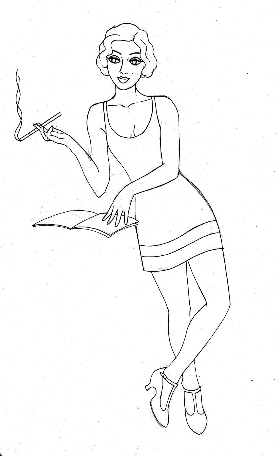
Modelling Victorian-inspired contemporary outfit
Steam Punk clothing
Catwalk model sporting Victorian-inspired outfit
Steam Punk clothing is inspired by Victorian clothing, its name deriving from the steam travel age (Victorian industrial revolution). While it clearly holds strong gothic influences, the Victorian style is evident through the jackets, cravats, shirts and lace.
If I imagine drawing a typical Goth, I want to draw a girl with flowing dark hair and a corset with a flowing black lacey skirt. While modern goths tend to add spikes, chains, studs...etc. (from the punk era), the essence of it is very Victorian.