 |
| If in doubt, do it yourself!: Hand and body positions for reference. |
Fig. 1 has been used to draw my flapper girl character leaning against the bar, body turned slightly to her right to read the directory from it. The main focus for my drawing research is the legs, with one bent behind the other. This is so that she can look casual and comfortable as she's engrossed in her reading.
Fig. 2 is so that I can draw her hands well, as she holds a long cigarette holder (imagine the cigarette holder in the right hand). The other hand is turning an imaginary directory page.
Fig. 3 is the same, only different positions so I can choose between the two when it comes to deciding on how she looks.
 |
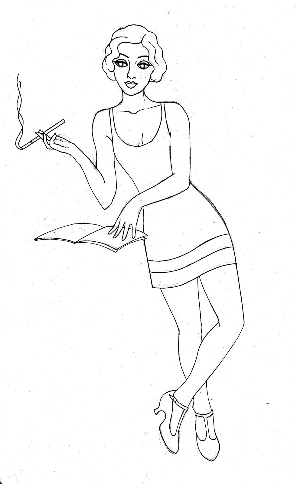
| One of the first drafts, drawn by reference (above) |
 |
| More anatomically correct version (awkward angle of hips to try to render!) |
 |
| More stylised version - different pose |
Digital outcomes:

 |
| 60's mod girl cover |
To fit an A4 cover, I'll just expand the illustration to fit. I really like this outcome but it took me quite a while to refine and clean up. When scanned in, you can see a lot of bleed from the pen ink and texture from the paper. I have to go around each line and neaten them up.
I will continue with the other two characters, to create a series, but I probably won't be using these outcomes for the final front cover. I feel they are better suited as post cards or gift card, as opposed to an editorial piece.
No comments:
Post a Comment